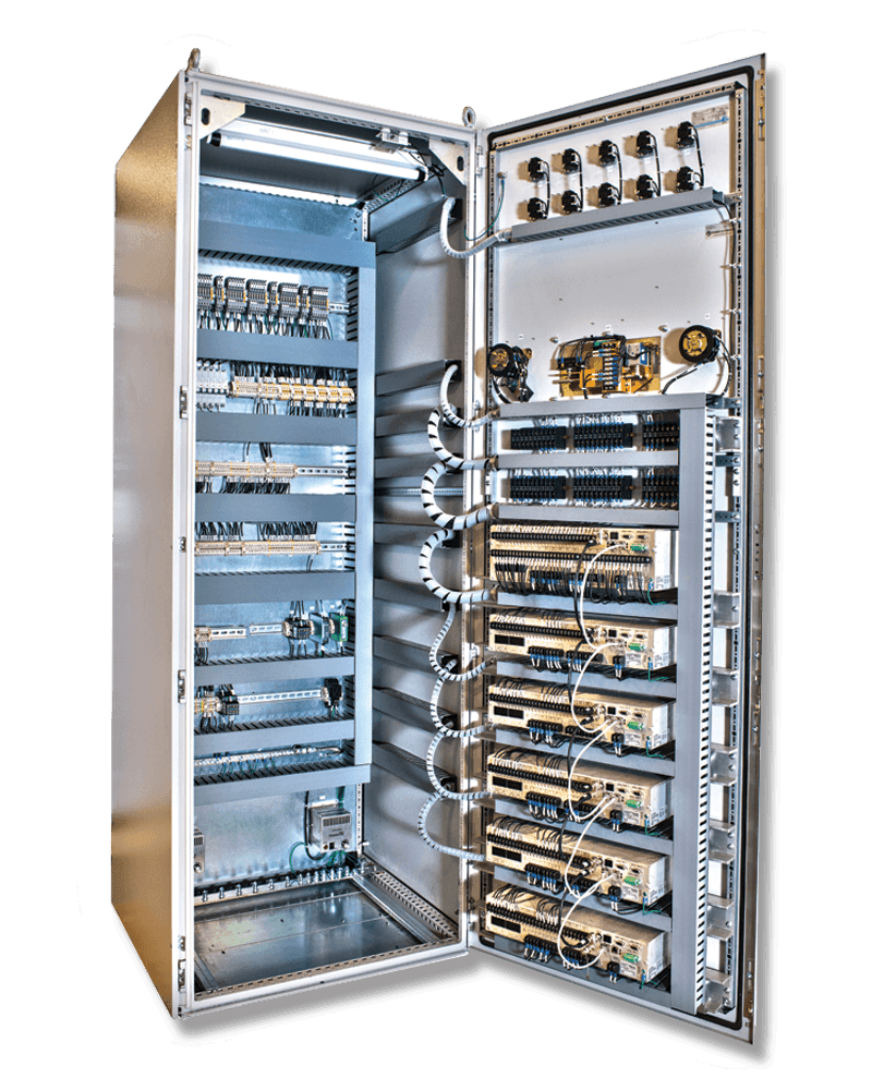
If you’ve ever manually controlled a machine, then you probably used something important you didn’t think twice about. That system is the HMI. A Human Machine Interface (or HMI) is a system which lets a user directly interact with and operate a machine. It encompasses all controls and alerts that a user may see, hear, or interact with.
These are used in everything from high-speed transportation to laboratory equipment to everyday household appliances. HMI panels provide safe and cost-effective controls. The key to a good HMI is for it to be self-explanatory and easy to figure out. Here are some best practices for designing your own HMI.
Know What the HMI Will Do
Before you start designing the system, write out every function that the HMI will control. It’s not worth it to finish the system then realize you missed a necessary function somewhere.
Also, what controls do you need for each function? The controls should make sense given the importance of the control. Don’t use a large lever for a minor control. Instead, use a small switch so it isn’t confused for an important control.
Finally, make sure that the controls are appropriate. A touch screen may not be a good choice for a machine that takes a beating from heavy vibrations in the environement.
Plan Out the Colors
A good HMI is one in which you don’t notice you’re using it. It has to be simple so that the task is to operate the machine, not to figure out the interface. One way to do this is to take advantage of colors. Our brains are wired to respond to colors in certain ways. An example of this is the stoplight. Keep this in mind when coloring.
- Green means the object is functional, good, going, etc.
- Yellow shows there is a warning
- Red indicates a failure, error, or a break
- Blue can indicate water/fluid or fluid levels
- Grey shows something is empty or inactive. Light grey makes a good background color
These apply for indicator LEDs or switches or screen GUIs. It helps to keep in mind the contrast of the colors. Make sure the greens and blues aren’t too similar to each other in hue. If you squint at the screen and can’t make out all of the objects, then you may need to increase the contrast.
Remember, the HMI should be there to translate the user to the computer, not to fascinate the user.
Designing the Perfect HMI Panels
If you need affordable HMI panels for your next project, our experienced staff can help you with everything from specifying the HMI enclosure to consulting on the entire design. PanelShop.com takes the pain out of control panel building by making the process streamlined and simple. Trust our engineers and electricians to help you achieve custom HMI panels for your next project.


